Hub backoffice
––– UX UI design
2020
Context
Along with the platform hub, the backoffice was an existent product, built without a UX project or a design system behind it, affecting the usability and experience.
What to do
To redesign an agribusiness' hub backoffice, addressing the users pain points. Reorganize, recategorize its structure, and design a new UI.


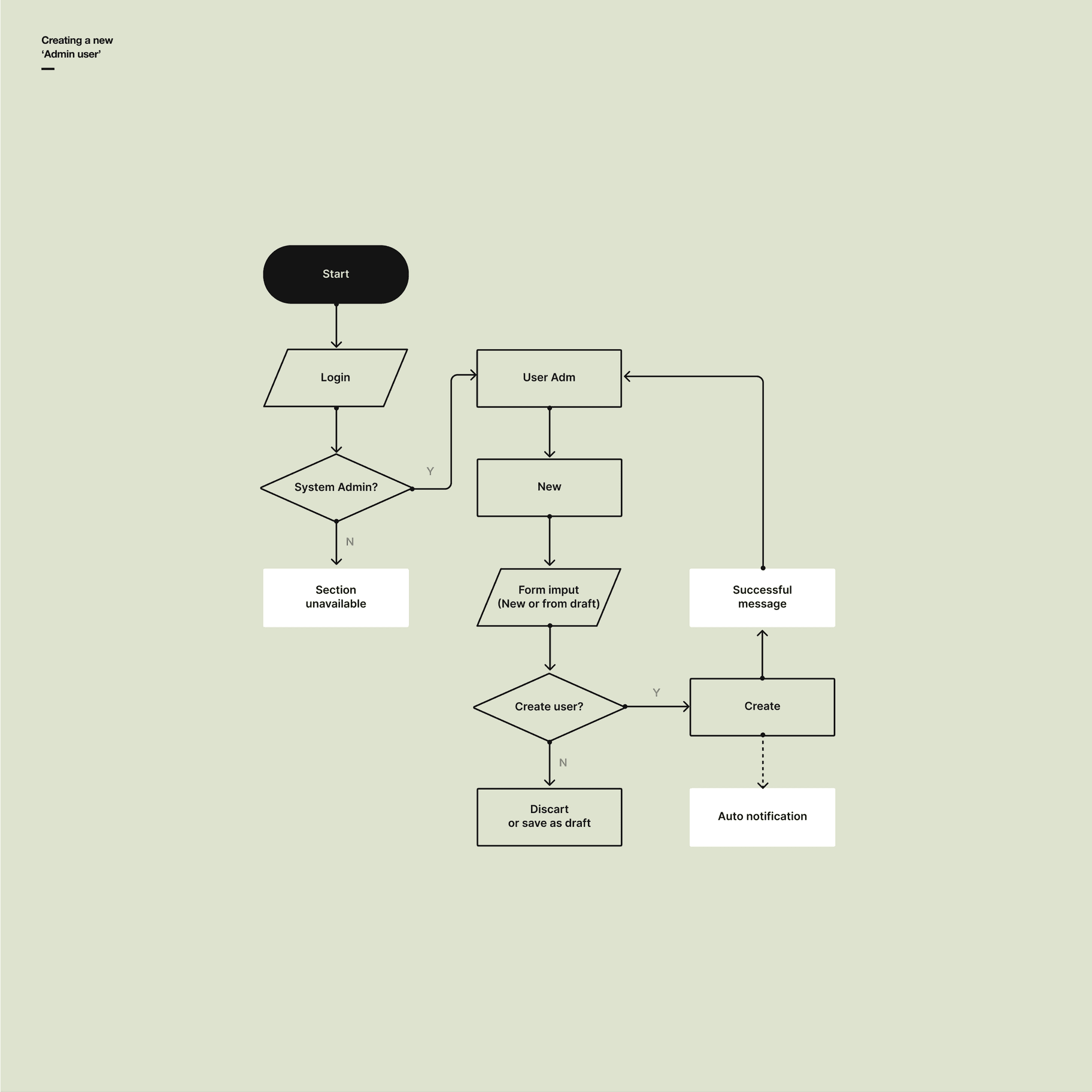
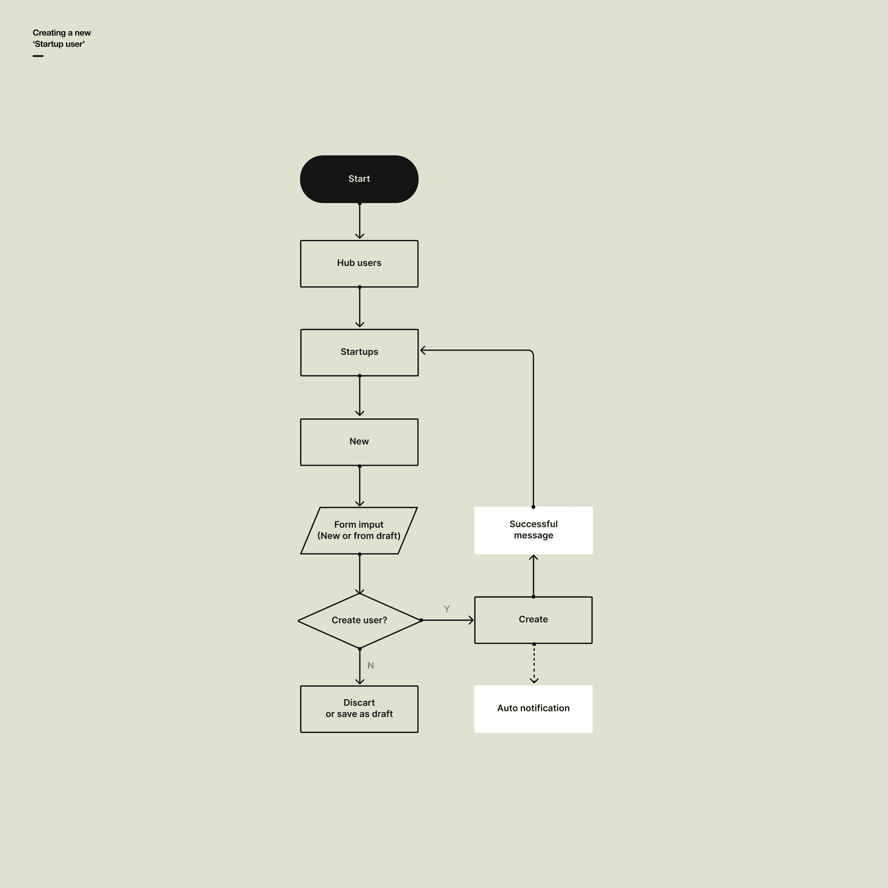
n the discovery, we mapped two different user journeys, named: ‘Admin’ and ‘System admin’. With this, it was possible to pinpoint exactly where the inefficiency of the actual process occurred, and also, to identify where the user pains affect the most for each user in his daily job and the communication problems with his peers.
This was the first step to categorize and organize all the tasks within the system in two different levels of permission. Some features would be visible for ‘system admins’ but not for ‘admins’.
User flows were designed for several different tasks and journeys. Below, the wireframes used to materialize the structure and backtesting with users before going for high-fidelity prototypes.


In order to quickly understand if the solution would serve users, the design of wireframes began with the screens of greater importance and value in their context, where there would be greater interaction, and tested quickly with some future users of the system, respecting the premises of moderation, that is, without inducing users.
With the data collected from the tests, some improvements were identified and quickly implemented in the wireframes. Associating the user’s "job to be done" with the product’s UVP (Unique Value Proposition).
Once validated the wireframes, the high-fidelity screens were designed to then be tested again, this time with other system users who had not yet seen the solution in the previous phases. Small adjustments were made, and the product was delivered.


